Exercise 1 Install & open up Adobe InDesign CC. Explore the interface.
In terms of tools and usage, I think that Adobe InDesign CC and Adobe Illustrator software are very comparable.
Create and Adjust Rules Guides
I was using the rulers tool, but I was seeking for a tool that I could evenly distribute across the entire page. I wasn’t sure how to use the guidelines to evenly measure the page. I believe it’s crucial to learn this in order to keep everything organised. On YouTube, I came across a video that gave me some insight and advice.
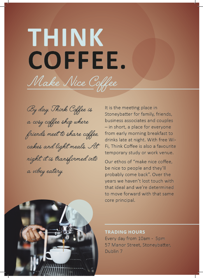
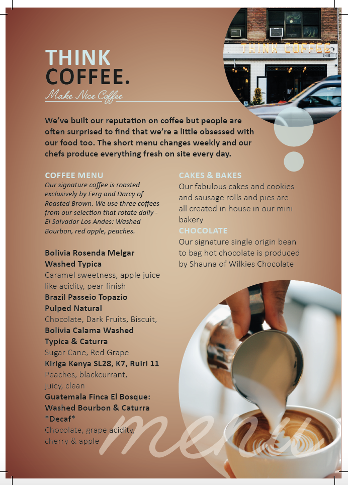
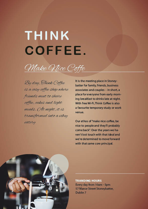
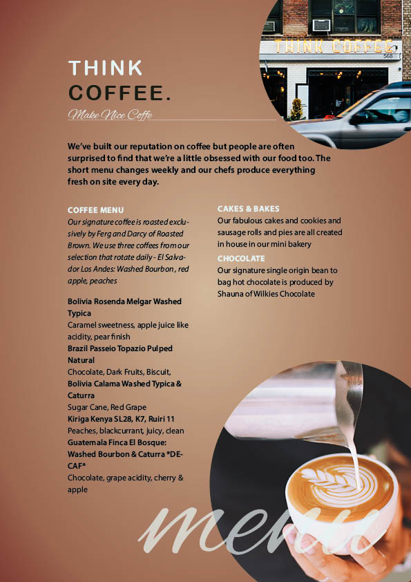
Original Version
My Version replicated
We attempted to duplicate the above-mentioned booklet today. I was not much familiar with InDesign, but after creating this brochure, I realised that many of its features are similar to those of Adobe Illustrator, which made it easier for me to understand and get acclimated to the software.
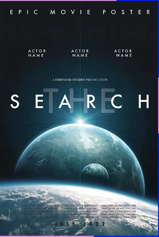
Exercise 2 Follow the tutorial to create an epic movie poster.
Width 27 inches (685.8 mm) and Height 40 inches (1016 mm), the North American standard size for a movie poster (also known as the ‘one-sheet’). Margin on all sides to 35 mm, and introduce a Bleed on all sides of 10 mm
Original: left side My version: right side
I enjoyed designing the movie poster. I had no trouble utilising the tools, but I still don’t quite grasp how to use grids and compute margins for decent looks.
Week 2
Today we created a Magazine page. We learn primarily about “Parents page” and comprehend its advantages.
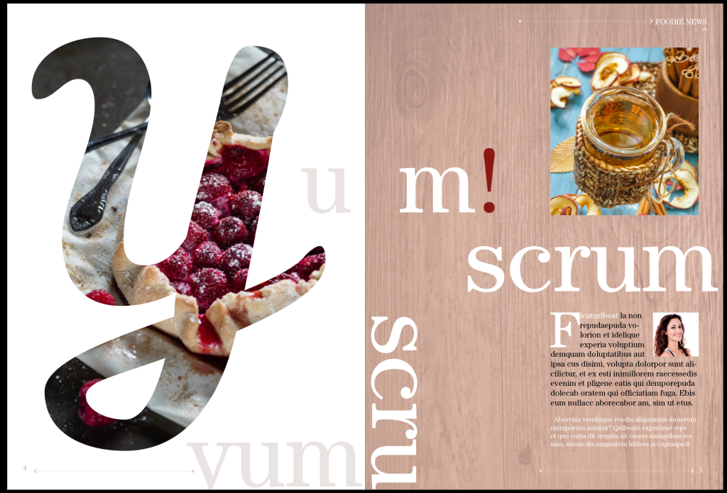
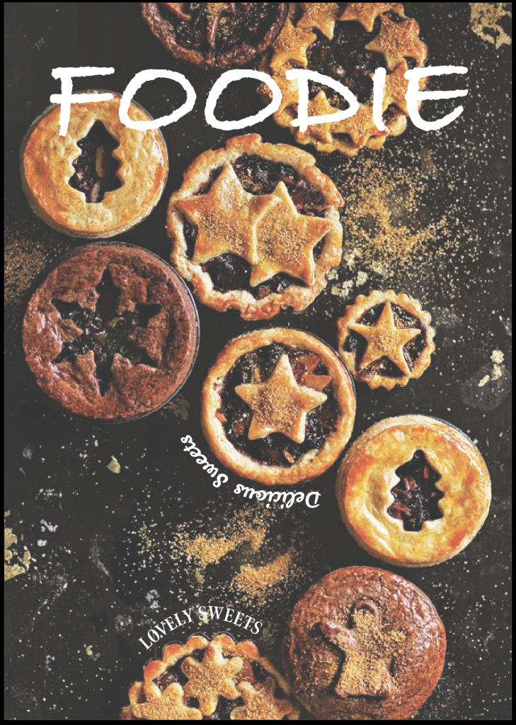
Exercise 1 Follow the tutorial to create a Food magazine Layout
Due to the several procedures that must be taken, creating the page was the part that I found to be the most perplexing. Note: Type > Insert special character > markers > current page number
I particularly appreciate how useful InDesign is for lining up paragraphs around shapes.
I am delighted to how my artwork turned. I struggled with rotate the message on the other side, but I discovered that it depends on which side you start using the pen tool; rotating wasn’t necessary.
In this exercise, we learnt how to use wrap around tool. That tool struck me as being intriguing to utilise to shape anything to highlight the white space which gives me many ideas to use in the future.
Week 4
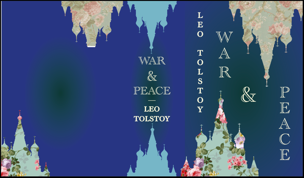
Create a Paperback book cover
This is the paperback exercise and the book cover I created in Digital illustration project. I truly like this exercise, and learning the crucial decisions to be made while making a book cover was interesting.
Exercise 2 Choose one of the two videos provided in class and make a list of 3 elements/graphics that you can see have motion applied.
Poki: When you scroll down on the website, the ball is moving around and giving instructions and make your eyes follow the places they want you to focus. Viewing it while you are experiencing the website it is fun. It seems to suit with the type of product they are offering. There is a white part that highlights all the benefits that you can get from them. It’s colourful and have a variety of mood/games.
Scout Motion: Despite the fact that the entire video was moving quite quickly. I understood that the business’s focus on “time” and “money”. The drawings of a hand with a watch which appears briefly before disappearing completely, in my opinion, it is quite attractive. Colour Palette uses: Blue and Green – Technology, Trust, Competence, Growth, Freshness, Quality. _____________________________________________________________________________
Exercise 3 Using 2 websites, mention 3 elements that have motion applied.
Toni & Guy website. The background effect with various pictures in movement for each title. Those pictures looks like they are cuts in several pieces when you scroll you mouse up or down. When you scroll to each titles, three pictures come up on the screen from the left hand side. When you put the mouse on top of those pictures, the sub title pop up in a bigger size to make more readable and a little hand shape pointer appear to show that it is ready to click on the page.
https://ie.boohoo.com For this website, I found only one motion. On the first page, I came across with this big picture with a message “40% off everything” highlighting. I like the colours they chose. Because it’s not aggressive and it fits nicely with the whole webpage. I think it could add more motion graphics around the page to make it more fun for the users to experience it. For example, few videos of models wearing their clothes, or a video mixing their logo with the model moving at the background.
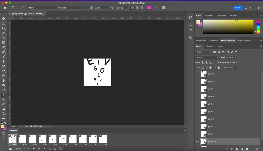
Today we started learning basics tools using After Effects. When I was doing the tutorial proved from the program itself, I think it was useful and makes me think that it’s not that complicated. Although it is very easy to get lost if you don’t organise the files and name them properly. I really like how it starts already and I’m looking forward for learning more about it.
Position 2D position layer – (x, y) 3D position layer – (x, y, z) Position of (0, 0) and (0, 0, 0) is the upper-left of the Composition panel. X – horizontal axis. Y – vertical axis. Z – depth in 3D – d the axis perpendicular to x and y.
Scale 2D layer can create the illusion of zooming in and out on the layer.
Exercise 1 Analysis of two website similar brand values or themes to my own brand.
https://www.irisvanherpen.com Iris Van Herpen’s website is attractive and well-kept. There is a brief film introducing the new collection when you open the first page. Everything is professional and sophisticated, which I want to incorporate that to my website.
https://eu.louisvuitton.com/eng-e1/homepage Louis Vuitton has a more vibrant website than Iris Van Herpen, which has a different vibe. I can sense the excitement and brand vibe from the video. Overall, I want to combine both emotions into one.
Exercise 2 Two logos with motion applied. Assess each, considering: Brand values Colours Shapes Style of Motion Message communicated
https://www.orangetheatrecompany.com OTC brings to the stage theatre that is both entertaining and thought-provoking. Considering that I want to make a graphic emotion that entertain the user. Brand values: Fun, consistency Colours: Yellow and black Shapes: Geometric Style of Motion: Fun Message communicated: Enjoyable, Fun
https://www.pinterest.ie/pin/464011567856639886/ Brand values: Fun, be you, confident Colours: Black, blue and pink, Gradient Shapes: 2D Style of Motion: Fun Message communicated: Enjoyable, Confidential
Exercise 3 Brainstorm Isolate shapes – square, pointed shapes Visual – illustration and photographs Themes that transferable to motion – Minimalist but functional Tone of voice – collide Text Copy – square text
How could I apply motion graphics to it to enhance your brand communication?
Use animation to move a subject(logo) around a scene.
On the screen, the letters “r” and “j” appear to be about to clash. Once the logo was constructed in the centre of the screen, it rotated to give the impression that you were in the center of a stage. Use the color scheme to depict the stage. I don’t want the background to have a motion effect since I want to highlight the movement of the logo.
Create background effects such as flowing patterns.
Add flickering and wiggling movements.
Wiggling lines to interpret illustration from the poster.
Introduce motion graphics to existing video content.
Use different types of cloths texture movements videos
Create visual effects such as motion blur
Considerations: Is there text in your logo? – Yes. The brand Tagline “Where Theatre & Fashion Collide” Is there an icon? – Just the logo Are there assets that you could add? (imagery, video footage) – Model photographs.
Exercise 1 Analyse my brand, considering the application of Visual Effects. Mood/Vibe: entertainment, floating, slow, elegant, sophisticated.
List two potential uses for visual effects in your motion design solutions. Bright lights, Atmospheric Smoke floating on the screen.
Describe the effect. Everything will be floating very slowly
Discuss the asset it would be applied to logo, video footage, pattern design
Discuss the affects of including these visual effects. It will give interesting or suspicious vibe that the target audience might want to know more about it.
Apply one visual effect of your choosing: make it rainy Customise the settings to communicate a message or feeling: made the screen darker which fits with the weather. Contrast of the woman running in the rain.
Apply a second visual effect that enhances the message
Document the result: At first, in my opinion, the video was disorganised. After some testing and attempts to direct the motion towards my message, I eventually achieved a partial outcome that I am so far very pleased with. However, I think I should strive to use the After Effect more and keep learning new things about the program.
Exercise 3 Using the footage provided, choose 2 of the 3 visual effects listed below to experiment with, using the theme of your brand to guide your decisions:
•Add any visual effect that will communicate feeling.
•Add text to the footage using the ‘Track Camera’ feature
•Add a graphic/image to the footage using the ‘Track Camera’ feature
Exercise 4 How might you promote your brand when the logo isn’t the central component of the advertisement? Using footage videos that communicate my theme brand.
Using your previous research, brainstorm potential promotional tactics that might apply to your brand.
Using one of the pieces of footage provided (Moodle), combine your choice of visual effects to entirely change the mood of the piece.
Exercise 1 Script for my logo animation. The logo is first placed flat down as if a stage, then lift them individually (“r” and “j”, and allowed to converge into the desired shape in the middle. I want to make it spin once they connected in the middle forming the logo itself. I want to incorporate the model photos as part of the branding too.
Exercise 2 Research: Find a motion graphics video and try capture how the storyboard may have been developed. – Consider the key scene – Create thumbnails of what these could be – Note transactions and details – Document your findings
I am keen on how each screen is organised and detailed.
Exercise 3 Based on your script, develop a storyboard for your logo animation.
Exercise 1 Animate a line from your brand messaging. – Choose a text animation effect and customise it, considering what parts of the text it is applied to and the timing of the animation.
Typography – Nova Square Wipe in to the center motion text. Easy Ease the rotation motion of the logo.
Exercise 3 Review your script and research: – Have you collected enough examples of communication through motion design? YES – Have you analysed collected examples critically? YES – Are these displayed on your blog? YES
The colour with the background did not match correctly. However I like how the slogan appears slowly on the screen.
According to reviews, the background did not express my brand clearly. It’s challenging to understand the voice’s tonality. a horizontal rotation of 360 degrees
This is the final piece of Logo Animation. Instead of turning a horizontal rotation of 360 degrees, I changed it to 360 clockwise rotation. Personally I think it works better with the brand and tagline.
CTAs Tricks & Tips 1. Give your audience a reason 2. Use commanding language 3. Incorporate emotions 4. Give it parameters 5. Consider the platform 6. Incorporate branding
Exercise 1 Research CTAs – What CTAs with motion incorporated can you discover? – Document and analyse minimum 3 examples, considering message and brand values.
Exercise 2 Write a script for your CTA. – Keep it basic to follow further visual exploration. – Keep its purpose in mind: what is the message this CTA will communicate? – Brainstorming before beginning your script.
Exercise 4 Develop your CTA motion graphic. – Consider placement on your website. – Ask yourself are there any skills you will need to develop on before creating your storyboarded graphic? – Do you need to generate further assets?
28th, Feb – Week 7
Exercise 1 Research Social Media Promotions. TikTok, Instagram, Pinterest
Exercise 2 Write a script for your Promotional Piece. Begin again with a brainstorm. Identify what message you hope to communicate. Identify the social media platform your promotion will feature on.
Instagram Similar to Facebook, and where it gets psychologically interesting, people can “like” your pins, but unlike Facebook, people don’t have to follow you to find your pins. To summarize, the main point of Pinterest is to share ideas with like-minded people, ideas that typically involve some sort of creative expression.
Pinterest I believe that Pinterest is a visual discovery engine for finding ideas like recipes, home and style inspiration. So thinking of my target audience I believe that people into fashion love to pin fashion features which they feel are interesting. Also I like when you discover Pins you love, save them to boards to keep your ideas organised and easy to find.
First of all, I used the rectangle tool to make the background red frame. I used the same tool to make the plus shape as well. I used the mouse to rotate the plus shape.
I choose the Avenir typeface to make this post.
I did a little bit of research about the Avenir typeface and put it in a square to align to the plus shape.
I made two cross lines using a pen tool pressing shift key to make them straight, then I used pattern opinion to make the background effect
For this one, I used the same effect for the lines. I choose a letter and went to the stroke panel, checked the dashed line and leave the dash to 12 pt.
First of all, I used the ellipse tool to make the circle. I used a start tool to make the green shape manage the three points by pressing the down arrow key, then to make each part longer, I press the command key and dragged it down with the mouse.
For this one, I made 2 copies of the circle and I choose the last bottom. I went to Object > Expand.
It made three layers (Compound Path, Path and Compound Path).
Delete the Path layer and ungroup it.
On this one, I made the gradient of the circle selecting each colour for each part.
I brought the “01” layer to the top. I put the stroke size to 2pt and expanded the stroke.
I opened the transparency panel and changed the Normal to Colour Dodge. I lowered the opacity to 60% then I added the radial blur effect.
For this one, I used the pen tool with the smart guide enabled. I connected three lines inside the star Mercedes shape. Selected the line and the shape and presses the divide option in Pathfinder.
To finish it, I coloured each piece as the tutorial and done!
5 Reasons to use the Pen tool 1. Most accurate way to create cutouts 2. Paths are always editable 3. Saves your paths for return access 4. Makes accurate selections from paths 5. Its selections can cut anything out
In this one, I made a selection to select the whole cube area.Then, I went to layer – new – layer via cut to cut the background part. Then I want to Layer – New – Layer via cut to cut the whole background.
This essay is the product of an early investigation into the factors that influenced women’s roles in modern society. Focusing on the era roughly from 1920 to the present. The beginning of “professionalization,” examines the scope and nature of women who created numerous designs based on the Victorian era and how they still impact the involvement in this development. While it is critical to retrieve the identities of individual designers, it is also critical to comprehend some of the conditions and attitudes that shaped the lives of women graphic designers by looking at how they were treated in both contemporaneous and later literature. The graphic design evolved as a profession during this time, evolving in reaction to societal and technological advancements.
Victorian Era Design/Typography
The victorian-style graphic design proved to be popular in the nineteenth century, particularly for ads. Many of the persuasive commercials were created in the last two decades of the nineteenth century, using Victorian designs and influences. Extensive typography, artwork, and colourful banners are all part of Victorian design. Romantic architecture has a strong sense of nostalgia and romanticism because it was significantly impacted by the past. Victorian graphic design encapsulated and communicated the era’s values. Children, maidens, puppies, and flowers were used to represent sentimentality, nostalgia, and a canon of idealized beauty. (Taylor Kaiser, 2014)
Figure 1
Competition arose as a result of the spike in people wanting to buy new products, and graphic design became involved. Manufacturers created posters, flyers, and pocket cards to persuade customers to buy their product rather than the one down the street in order to compete. (Dylan Spiteri, 2014)
At the same time, new printing machines were developed, resulting in finer print, which gave advertisers and graphic designers more power and creativity. The organized placement of images and text, as well as the brilliant colours, indicate that the posters being created were quite positive. This was done because people were enthralled by new technological advancements, and the Victorians were right in the thick of it. (Dylan Spiteri, 2014)
Figure 2
Louise Fili’s trajectory as a Graphic Designer
Louise Fili is a graphic artist with extensive expertise in drawing, typography, and packaging design. Fili first travelled to Italy with her parents when she was 16 years old, where she fell in love with the cuisine, type, and Italian culture, all of which continue to influence her work now. (Holly Grobholz, 2018)
“When I was in high school I taught myself calligraphy I still didn’t know what graphic design was, when I got to college I found out about graphic design” (Fili,L. 2012)
Figure 3
She draws inspiration for her type designs from Italy and the Victorian era. This was dubbed ‘Retro’ by certain New York designers. Artists were developing a fondness for quirky and Elegant type that was utilized in the 1920s and 1930s, despite the fact that this form of typography was abandoned after World War II. (Holly Grobholz, 2018)
Fili’s book cover designs exhibit her attention to detail, which assists in her quest to tone down a book cover’s voice while still making it unique and stand out. (Holly Grobholz, 2018) Like the book, Elegantissima is one of the famous Louise’s books.
Figure 4
Fili enjoys resurrecting old fonts and interpreting historical fonts. (Louise Fili,2013) Many examples of her work can be seen that are directly influenced by the design of the Art Deco and Art Nouveau periods.
In 1989 Louise Fili Ltd. was founded when she gave two weeks’ notice at Pantheon Books to focus full-time on her passion restaurant identities and food packaging. She faced an obvious difficulty as a sole-owner female launching a design business in the 1980s: what to label the studio. she explains. “There was no Internet back then.” She couldn’t be too inventive with the name because people had to look me up in the phone directory. She understood that naming the business after myself would be a liability, but she wanted to convey a clear message: “If you don’t like me because I’m a woman, then you’re not welcome as a client.” (Lee Magill, 2022)
Comparative Designers
Figure 7 –
Jessica Hische’s trajectory as a Graphic Designer
Jessica Hische’s work blends design, typography, illustration, brown sugar, and heavy cream in equal measure. Jessica’s expertise with colour, tone, and shade is amazing. Each design she creates is wonderfully matched. Jessica Hische is an illustrator and typographer based in Brooklyn, New York. She earned a Graphic Design degree from Tyler School of Art in 2006, worked for a number of high-profile companies and clients, and then began a freelancing career in 2009, with great success and at such a young age! (Ray, 2011)
Figure 8
Hische conveys her lively, cheerful, and young soul via her works, whether it’s an illustration or typefaces she’s made, as a young designer in this current period. The expressiveness and slang language’ she used to connect with her audience, clients, and fans have become a good confirmation of her young soul, as seen by what she posted on her website about her career and personal ideas. (Ray, 2021)
Figure 9
Working with Louise Fili
While interning at Headcase Design in Philadelphia near the end of college, Hische began making plans to leave the city. She spent $2,000 on the promotion and created and mailed 250 hand-drawn self-promotional pieces. Louise Fili, New York City’s Restaurant Queen, was the only one who returned the call. She made an employment offer to Hische. (Mattew Porter, 2022) “She was my design mom,” Hische said of her time at Louise Fili Ltd. She is a wonderful nurturer. She’s the type who remembers your birthday and remembers to bring the cake. She kept the studio calm because she knew how to schedule work so that you didn’t have to deal with crazy deadlines and workloads.” (Ways we work, 2022) Clients began requesting Hische as her portfolio transitioned from “illustration” to “illustrative lettering.” Hische took on freelance projects at night with Fili’s permission. “The freelance projects allowed me to grow professionally because they allowed me to apply Louise’s lessons to my personal work,” she says. Her self-assurance grew. She started to believe in her instincts. She began to experiment with new ideas. (Ways we work, 2022)
Comparative Style
Figure 12
Conclusion
Louise Fili and Jessica Hische worked together and now they have their independent success studios.
Women in the creative world are getting some of the recognation they deserve.
Even though many years have passed, the Victorian-era design are still around us and are being inspiration for many contemporary artists.
Holly Grobholz – History of Graphic Deisng – Louise Fili, (2018) [online] go.distance.ncsu.edu Available at:<https://go.distance.ncsu.edu/gd203/?p=24427> [Accessed 10 March]
Mattew Porter – Jessica Hische For this Brooklyn illustrator, art and type elegantly coexist. [online] britannica.com Available at:<https://www.commarts.com/features/jessica-hische> [Accessed 10 March]
Pop art is an American and British art movement that began in the 1950s and flourished in the 1960s, drawing influence from popular and commercial culture. During the 1960s and 1970s, people from all cultures and countries contributed to the movement. (Tate, 2022)
Figure 1 – Roy Lichtenstein leaves it up to the viewers to decide what has just transpired in his 1964 painting of a tense phone call titled Ohhh … Alright ...
Characteristics:
Pop artists believed that art displayed in museums or taught in schools did not accurately portray the actual world, therefore they turned to modern popular culture for inspiration. Pop Art was dubbed “anti-art” during its peak because it refused to adhere to contemporary art norms at the time.
They often exploited design industry practices such as commercial screen printing and massive graphic layouts, emulating ads, billboards, catalogues, and other marketing propaganda found in their environment. As a result, the style was originally known as ‘Propaganda Art.’ (Rise Art, 2022)
Colour, Theme and Typify:
In fact, in Pop Art, branded or commercial iconography is a major motif. Logos or impersonal images were used to promote the concept that art might be inspired by everything and anything, not simply history, mythology, or morality. Bold colours, especially primary colours such as red, blue, and yellow, are frequently used in Pop Art. The colours were often vivid and reminiscent of a comic strip. These colours did not reflect the artist’s inner world or self, as they had in previous, traditional art forms, but rather mirrored the bright, popular culture around them. (Rise Art, 2022)
“The Pop artists did images that anybody walking down Broadway could recognize in a split second—comics, picnic tables, men’s trousers, celebrities, shower curtains, refrigerators, Coke bottles—all the great modern things that the Abstract Expressionists tried so hard not to notice at all.”
Andy Warhol
The main practitioners:
Andy Warhol was a successful magazine and an illustrator who became a leading artist of the 1960s Pop art movements.
Eduardo Luigi Paolozzi was a Scottish sculptor and graphic designer who was well-known for his work. He is widely regarded as one of the forefathers of pop art.
Peter Blake was born in Kent in 1932 and is regarded as one of the country’s earliest pop performers. He was one of a group of young artists that began painting and sculpting about popular culture in the 1950s. Films, comic comics, and pop music were among the subjects they depicted.
Roy Lichtenstein was an American artist who became famous for his bright and bold paintings of comic strip cartoons as well as his paintings of everyday objects.
Robert Indiana was an influential figure in the pop art movement in the United States. His “LOVE” print, which he initially designed for the Museum of Modern Art’s Christmas card in 1965, served as the inspiration for his 1970 Love sculpture and the widely disseminated 1973 USPS “LOVE” stamp.
Robert Wesley Wilson known as Wes Wilson was an American artist and one of the most well-known psychedelic poster designers. He created a style that is now associated with the peace movement, the psychedelic age, and the 1960s. He is best known for making posters for Bill Graham of The Fillmore in San Francisco.
Richard Hamilton was a British painter and collage artist who was one of the original fathers of Pop Art. He was born February 24, 1922 and died September 13, 2011.
Figure 5 – “I don’t care! I’d rather sink — than call Brad for help!” laments Lichtenstein’s 1963 Drowning Girl
Figure 6 – Robert Indiana, Love, 1967
Figure 7 – The Doors, Wes Wilson, 1967
Figure 8 – The estate of Richard Hamilton
Contemporary Design or Designers:
Keith Haring was born in Reading, Pennsylvania, on May 4, 1958, and reared in Kutztown, Pennsylvania. He learned fundamental cartooning abilities from his father and the popular culture around him, such as Dr Seuss and Walt Disney, at a young age. Haring worked with performance, film, installation, and collage while a student at SVA, all while keeping a strong devotion to drawing. When Haring observed disused advertising panels coated in the matte black paper in a subway station in 1980, he discovered a highly successful medium that allowed him to interact with the larger audience he needed. Throughout the subway system, he began to doodle in white chalk on these blank paper panels. (The Keith Haring Foundation, 2022)
Figure 9 – Keith Haring Drawing Series, January 1982
The standardization of visual form through simple, concrete and rational information, eliminating any type of visual interference, with the aim of being universally understood, were the characteristics of the modernist artistic movement called the International Style. (Diogo Terror, 2009)
Figure 1 – Josef Müller-Brockmann
Figure 2 – Geometric Swiss Style
Figure 3 – Proportion Swiss image style
Characteristics:
The Swiss manipulate typefaces just as they do with basic shapes, giving rise to great compositions where you see the full personality of the fonts without missing a photo or artwork for the design in question. Asymmetric organization of design elements in a mathematically constructed grid, objective photography and text with clear and factual visual and verbal information. The initiators of the movement believed that sans serif typography expresses the spirit of a more progressive era and that mathematical grid are the most readable and harmonious means of structuring information. (Callie Budrick – Swiss Style 2020)
Colour, Theme and Typify:
Large corporations used the new utilitarian design in their goods and corporate identities. Everything that wasn’t required for the product to work was removed. Its design ideas stress clean lines, form balance, and readability. Graphic cages that define asymmetrical layouts, sans serif typefaces, rigorous mathematical forms, and the usage of photos over illustration are used to achieve these results. (Darth Vader, 2022)
The main practitioners:
Josef Muller-Brockmann got popular for making the use of grids within design.
Adrian Johann Frutiger was a Swiss typeface designer.
Ernst Keller was teacher and pioneer of the Swiss Style.
Armin Hofmann was a graphic designer. His work is recognized for its reliance on the fundamental elements of graphic form – point, line, and shape – while subtly conveying simplicity, complexity, representation, and abstraction. (MoMA 2022)
Jan Tschichold organised most of the modernist design principles.
Figure 4 – Beethoven Poster, Josef Müller-Brockmann, 1955
Figure 5 – Beethoven Poster, Josef Müller-Brockmann, 1955
Figure 6 – Ernst Keller images
Figure 7 – Armin HofmannM B Co Zurich
Contemporary Design or Designers:
Kati Forner has worked in print, digital, packaging, and interactive design, and her work is beautiful and minimalist. She relocated her creative studio to Los Angeles five years ago and has been building identities for beauty, fashion, and lifestyle firms ever since. “Design has the capacity to communicate stories, increase engagement, alter companies, and build a business,” the firm thinks. (Jacque Ostrom, 2019)
Figure 8 – Muse + Metta Campaign
Figure 9 – Muse + Metta Kombucha
Figure 10 – Muse + Metta Kombucha
Figure 11 – Muse + Metta Kombucha
Kati’s branding and package design for Muse + Metta Kombucha is perfect for expressing an aspirational lifestyle; it appears strong, yet the lightness and effervescence are palpable. The cool colours she lends to each flavour are so varied and beautiful. (Jacque Ostrom, 2019)


